Accurate diagnosis in healthcare is one of the most critical processes in breast cancer treatment. In this use case, I have performed an analysis of the Breast Cancer Wisconsin (Diagnostic) DataSet. The goal is to classify whether a breast cancer tumor is benign or malignant from ten real-valued features are computed for each cell nucleus. This analysis shall prove to be helpful for doctors.
This dataset was created by Dr. William H. Wolberg, a physician at the University Of Wisconsin Hospital in Madison, Wisconsin, USA.
https://www.kaggle.com/uciml/breast-cancer-wisconsin-data

Data Visualisation
Visualization of data is an essential aspect of data science. It helps to understand data with insights and also to present the data to another person. I used several Python visualization libraries such as Matplotlib, Seaborn to draw plots to gain specific insights.
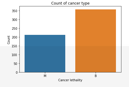
We can identify that out of 569 persons of the dataset, 357 are labeled B (benign) and 212 as M (malignant). This distribution may cause skewed ‘M’ values.
We can find any null data points of the data set using the following pandas function.
From boxplots, we can see data distribution and also identify outliers.
By plotting the correlation matrix, we could see many columns are very highly correlated, which causes multicollinearity, we shall use PCA to deal with highly correlated features.
Feature Engineering
The ‘M’ values in the dataset are a bit skewed, I performed oversampling using SMOTE (Synthetic Minority Oversampling Technique).
SMOTE is an oversampling technique where the synthetic samples are generated for the minority class. This algorithm helps to overcome the overfitting problem posed by random oversampling.
This has us 50% values of both ‘M’ and ‘B’ in the dataset.
from imblearn.over_sampling import SMOTE
sm = SMOTE(random_state = 42)
X_res, y_res = sm.fit_resample(X,y)
X_res = pd.DataFrame(X_res)
Y_res = pd.DataFrame(y_res)
Feature Scaling was performed on the feature dataset using StandardScalar.
scaler = StandardScaler()
scaler.fit(X_train)
X_train = pd.DataFrame(scaler.transform(X_train), columns=X_train.columns)
X_test = pd.DataFrame(scaler.transform(X_test), columns=X_train.columns)
PCA:
PCA has been performed on an existing dataset and a new dataset has been formed with n=5 principal components.
n_components = 5
pca = PCA(n_components=n_components)
pca.fit(X_train)
pc_train
Principal components analysis (PCA) is a statistical technique that allows identifying underlying linear patterns in a dataset so it can be expressed in terms of other data set of a significatively lower dimension without much loss of information.
The final dataset should explain most of the variance of the original data set by reducing the number of variables. The final variables will be named as principal components.
pca.explained_variance_ratio_
array([0.46960336, 0.18512009, 0.09477612, 0.06351298, 0.05197679])
pca.explained_variance_ratio_.cumsum()
array([0.46960336, 0.65472345, 0.74949957, 0.81301255, 0.86498934])
Splitting the dataset into the Training set and Test set
X_train, X_test, y_train, y_test = train_test_split(X_res, Y_res, test_size = 0.3, random_state = 0)
Model Selection
I trained the following models on the dataset, Logistic Regression, Support vector classifier, Random forest classifier, K-Nearest Neighbours.
Logistic regression is a method for fitting a regression curve, y = f(x) when y is a categorical variable. It is a classification algorithm used to predict a binary outcome (1 / 0, Yes / No, True / False) given a set of independent variables.
Logistic Regression uses a more complex cost function, this cost function can be defined as the ‘Sigmoid function’.
Hypothesis function for logistic regression:

pca_model = LogisticRegression()
pca_model.fit(pc_train, y_train)
Model Accuracy (PCA Data): 97.20930%
pca_model_acc = accuracy_score(y_test, pca_model.predict(pc_test))
0.9720930232558139
KNN
K Nearest Neighbour (KNN) is one of the simplest algorithms that calculate the distance between the query observation and each data point in the training dataset and finds the K closest observations.
When we use the Nearest neighbor search algorithm, it compares all the data points with the mentioned query point and finds the closest points.
There are many ways in which we can find the distance between two data points. The most commonly used distance metrics are “Euclidean distance” and “Hamming distance”.
knn = KNeighborsClassifier()
knn.fit(pc_train, y_train)
y_pred_knn = knn.predict(pc_test)
print(accuracy_score(y_train, knn.predict(pc_train)))
knn_acc = accuracy_score(y_test, knn.predict(pc_test))
0.9720930232558139
SVC
SVM maximizes the margin by learning a suitable decision boundary/decision surface/separating hyperplane.
from sklearn.svm import SVC
from sklearn.model_selection import GridSearchCV
svc = SVC()
parameters = {'gamma' : [0.0001, 0.001, 0.01, 0.1],
'C' : [0.01, 0.05, 0.5, 0.1, 1, 10, 15, 20]}
grid_search = GridSearchCV(svc, parameters)
grid_search.fit(pc_train, y_train)
svc_acc = accuracy_score(y_test, svc.predict(pc_test))
0.9674418604651163
Model Score Comparison
*pca_model= logistic regression model