QBoard » Advanced Visualizations » Viz - Tableau » How to display 40 + columns in Tableau?

How to display 40 + columns in Tableau?

  • I am trying to do a list report with about 40 columns(Dims+measure) but not able to get it right, the requirement pushes the Tableau limitation by exploiting its limit to only 16 columns.

    How can I get this done?
      September 23, 2020 12:47 PM IST
    0
  • Go to Analysis-->Table Layout -->Advanced and change the number in Rows and Columns as per your need.

    You can't add more than 16 to this, but increase it to 16 (for identification). So, save the Tableau file with extension .TWB. Then open this file in notepad.

    Then search for the text: attr='row-levels'.

    You will find something like:

    <format attr='row-levels' value='16' />
              <format attr='row-horiz-levels' value='16' />

    Change the value of 16 to desired column numbers. Save the notepad file. Open it in Tableau.

      September 23, 2020 2:35 PM IST
    0
  • The measures names and measures values special fields can help here and covers most use cases. (Using the measure names and values fields is likely a better choice than creating 40+ marks cards as you did in your posted example)

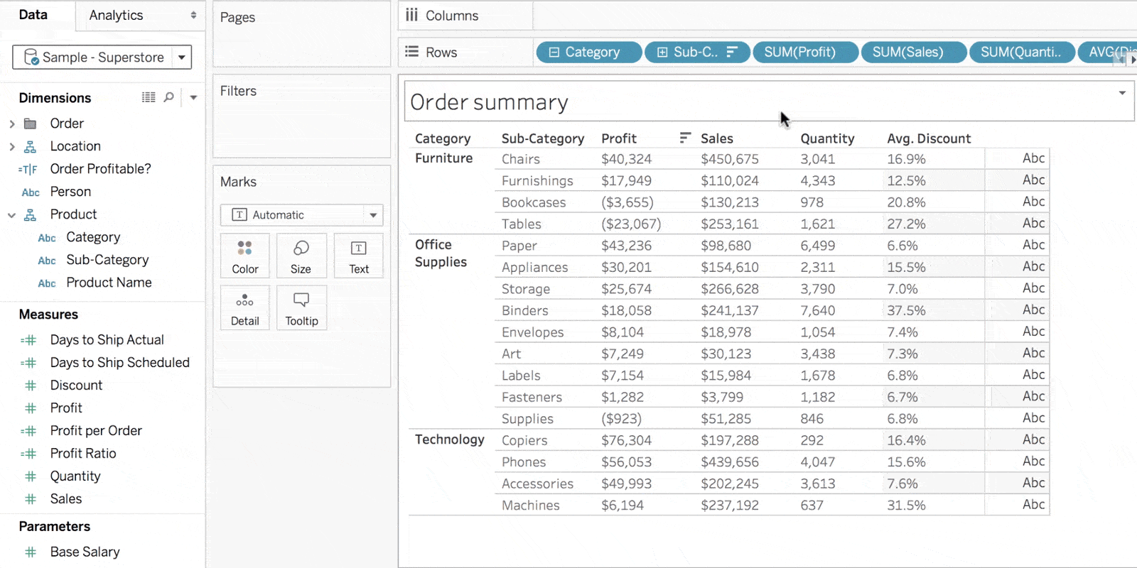
    Put Measure Names on the column and filter shelves and measure values on the text shelf. Then add the measure fields you want to the Measures Values shelf. Then put the dimensions that you wish on the rows shelf.

    A single field+aggregation can only be on the Measure Values shelf once, but a field can repeat with different aggregations -- so you can show the min, avg and max of a measure in 3 different columns.

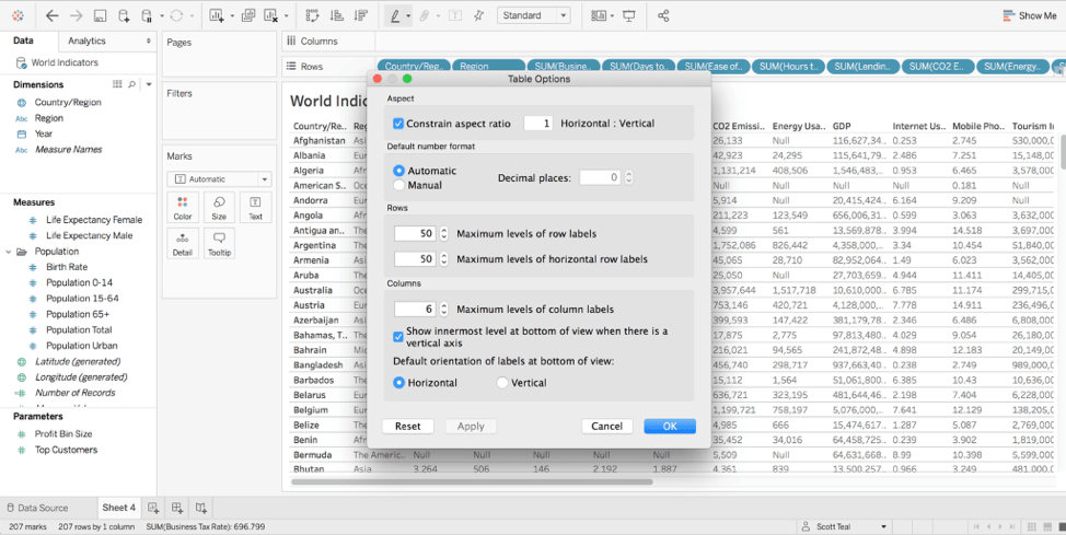
    As you mentioned, you can increase the max col and row headers up to 16 each via the Analysis->Table Layout->Advanced menu and panel. Beyond that point, adjacent columns will still display, just be coalesced for display.

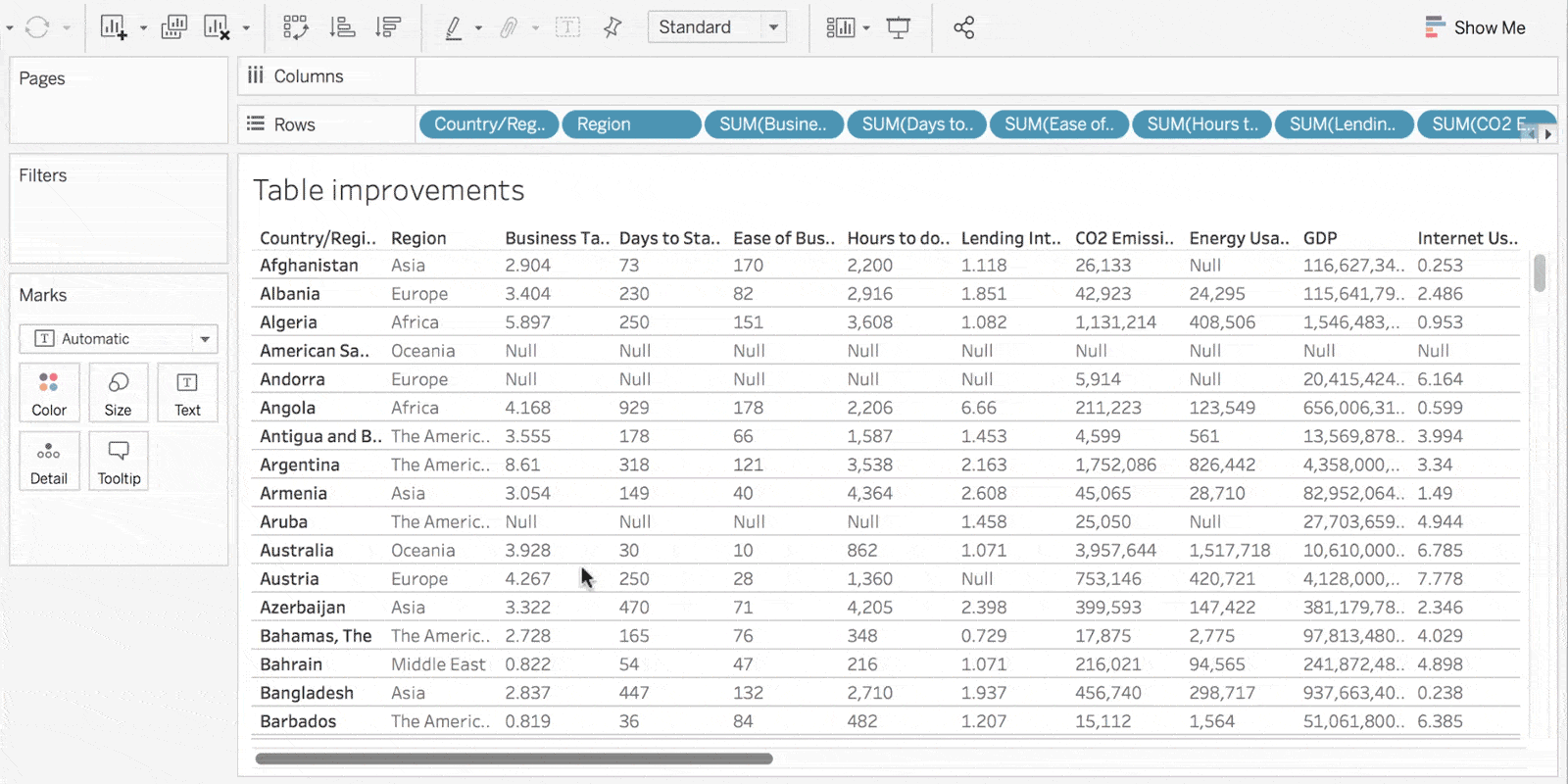
    Still you can have an apparently arbitrary number of fields on the measures values shelf, so can display as many columns of measures (data) as you wish, even though adjacent header columns for dimension (~category) get coalesced for display once you hit the header limit.

    Tableau is optimized for summarizing data for efficient interpretation by humans, so displaying extremely wide tables of data is not the best fit for the tool (or a human reader frankly). Importing and exporting large tables is certainly possible.

      September 23, 2020 2:36 PM IST
    0
  • To get started building your table, simply drag and drop discrete fields (blue pills) on the Rows shelf in your worksheet. Adding each discrete field will add its respective column to the table—up to a maximum of 50 columns. In order to build a list table like the one below, you will need a unique field (per row) as the leftmost column in your view, such as Row ID.


    In addition to increasing the column limit, we’ve made improvements to make it easier to navigate these wide tables. With Tableau 2019.4, you can now horizontally scroll across the entire table, to see all of your dimensions and measures.


    Sort by any dimension or discrete measure

    We’ve also made sorting more useful and intuitive, with the ability to sort the entire table by a discrete measure or dimension. Simply click on the column header to sort the entire table. In the below example, seeing all of my orders sorted by highest to lowest sales, or quantity, takes just a couple of seconds.


    Three tricks for working with tables

    As simple as the end result looks, there are some tricks to making an impactful table. We’ve highlighted some of our favorite approaches below.

    Use a table as a supplemental viz — Tables are great for getting to a granular level of detail. At the same time, all of the details can be hard to understand without some surrounding context. Consider building dashboards with a primary high-level viz, such as a map or scatterplot, and supplement it with a table below. This makes it easy for the user to drill down into a mark, and view further details as needed.

      September 15, 2021 12:36 PM IST
    0
  • Here is a workaround for some data sets:

    • convert your fields from Dimension to Measure, and then
    • display using Measure Names / Measure Values, as @Alex Blakemore suggested.

    For example, Boolean fields can be converted to numeric using INT().

    PROS:

    1. It is easier to change which fields to plot using Measure Names / Measure Values.
    2. Faster performance, at least for some data sets.

    CONS:

    1. Often data sets have some fields that cannot or should not be converted to measure.
    2. Not as easy or straightforward as changing Analysis > Table Layout > Advanced settings, or the xml-editing workaround
      September 23, 2020 2:37 PM IST
    0
  • There are Two ways:

    1. Edit the saved .twb file and edit the Below xml code by opening the workbook with Notepad

       <format attr='row-levels' value='16' />
        <format attr='row-horiz-levels' value='16' />
    2. Create 3 different worksheets each consisting multiple column but each worksheet consisting columns >16 and place them in single dashboard. So you will get one view with 40 columns.

      September 23, 2020 2:38 PM IST
    0