The trick with Tableau dashboards on mobile is to design the dashboard to fit the screen size of the smallest device you want it to work on. Dashbaords can be set to automatically resize, but the results are acceptable but not perfect as some dashboard elements will often end up truncated on smaller screens.
The best way to experiment with this is to test the dashboard you are building using different screen sizes and see how they work (you can set the minimal size you want as the base by choosing an option to make the designed size the minimal size; dashboards will then expand if the actual size is larger). Some device screens are selectable automatically for convenience (iPad, for example) ad it is worth testing these out when designing a dashboard.
The interaction UI elements adjust automatically to the device browser standard which saves a lot of effort.
Tableau will support any device with a browser.
It looks like the dashboard itself will automatically resize, but the responsiveness is limited to the dashboard design. What you can do, however, to is design multiple dashboards, one for each screen size you wish to accommodate, and embed them within a css framework on a custom page.
See how this person does it.
Each dashboard will ultimately contain identical data/visuals, but arranged in different ways to better suit differently sized screens.
If a certain visual will not fit on a mobile screen, you will have to think of a creative way to display this data differently on mobile, or just eliminate it from the mobile view.
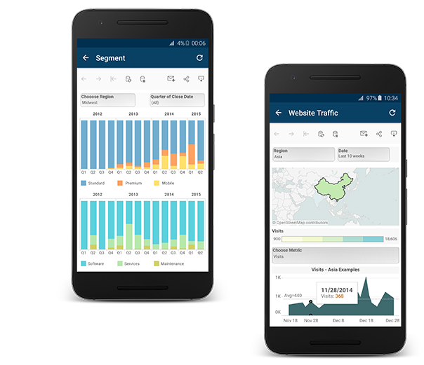
Dashboards can include layouts for different types of devices that span a wide range of screen sizes. When you publish these layouts to Tableau Server or Tableau Online, people viewing your dashboard experience a design optimized for their phone, tablet, or desktop. As the author, you only have to create a single dashboard and deliver a single URL.
Tip: In addition to optimizing layouts for mobile, optimize workbook performance to better meets the needs of mobile users, who often have limited bandwidth and are in a hurry.
Device layouts appear on the Dashboard tab, under Default. Initially, each device layout contains every item in the Default dashboard and derives its size and layout from Default as well.
Think of the Default dashboard as the parent, and the device layouts (desktop, tablet, and phone) as its children. Any view, filter, action, legend or parameter that you want to add to a device layout must first exist in the Default dashboard.
To save time with a unique Phone layout option that automatically reflects changes to the Default dashboard, either click the open lock icon  , or choose Auto-Generate Layout from the pop-up menu.

If you instead click the closed lock icon  or choose Edit Layout from the menu, the Phone layout becomes fully independent, so you'll need to manually add and arrange items to reflect changes to the Default dashboard.

Unlike Phone layouts, you need to manually add Desktop and Tablet layouts to a dashboard. Desktop and Tablet layouts are always fully independent from the Default dashboard, so each device layout can contain a unique arrangement of objects.

Two options let you automatically add phone layouts:


